My packaging designs draw attention and relay the correct message to consumers about the relevant product.
Logo & Packaging design
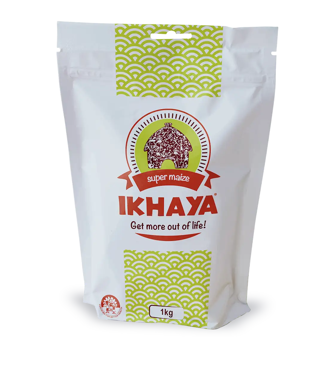
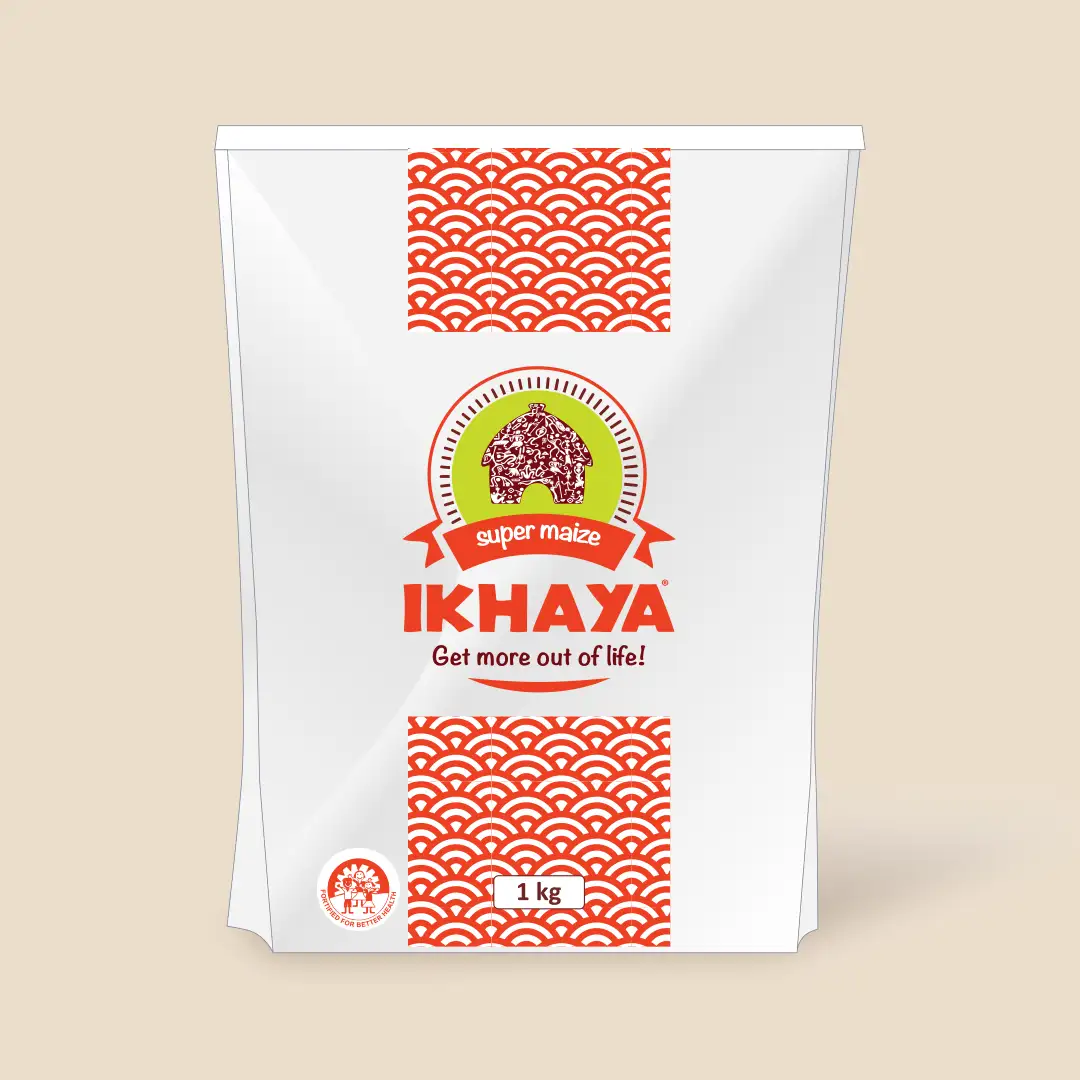
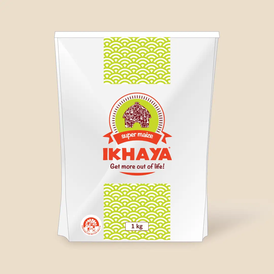
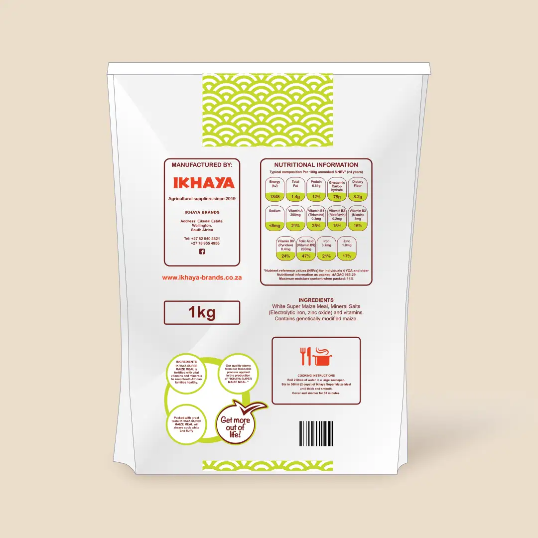
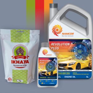
Ikhaya Brands
The customer wanted an African hut somewhere in the logo. I decided to go with an African culture theme as the concept, but in a contemporary style, creating figurines to fill the shape of a hut, representing African authenticity, and using contemporary colouring and pattern design to stand out against competitors.
Local contemporary approach
Brand update
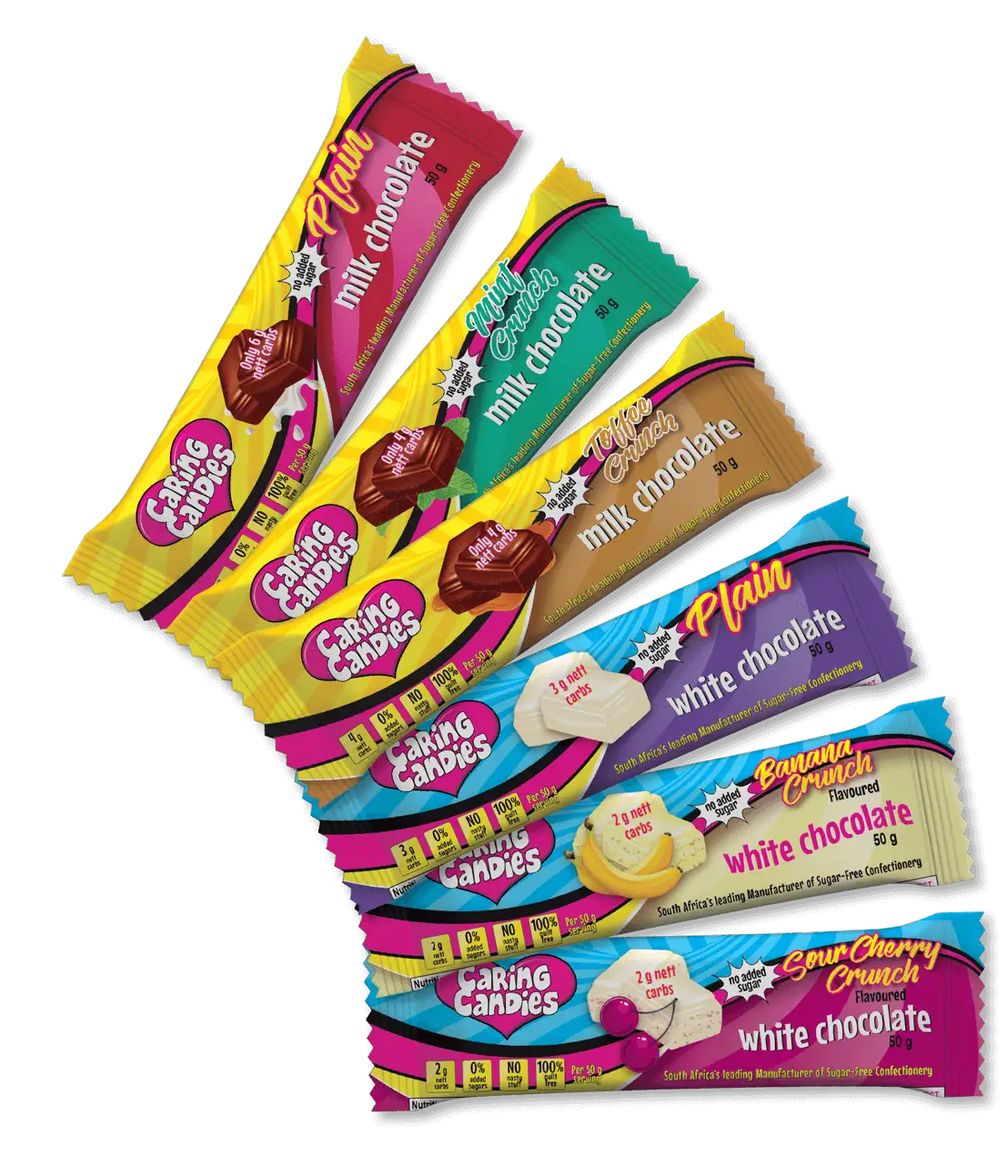
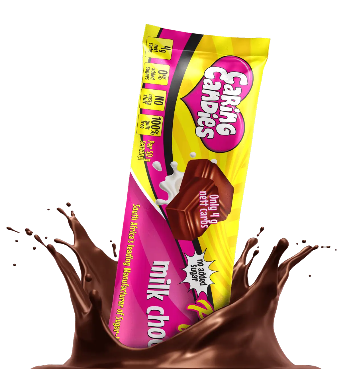
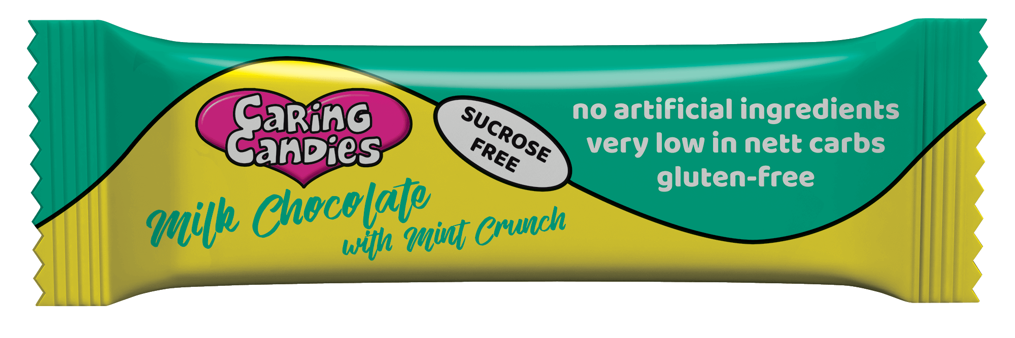
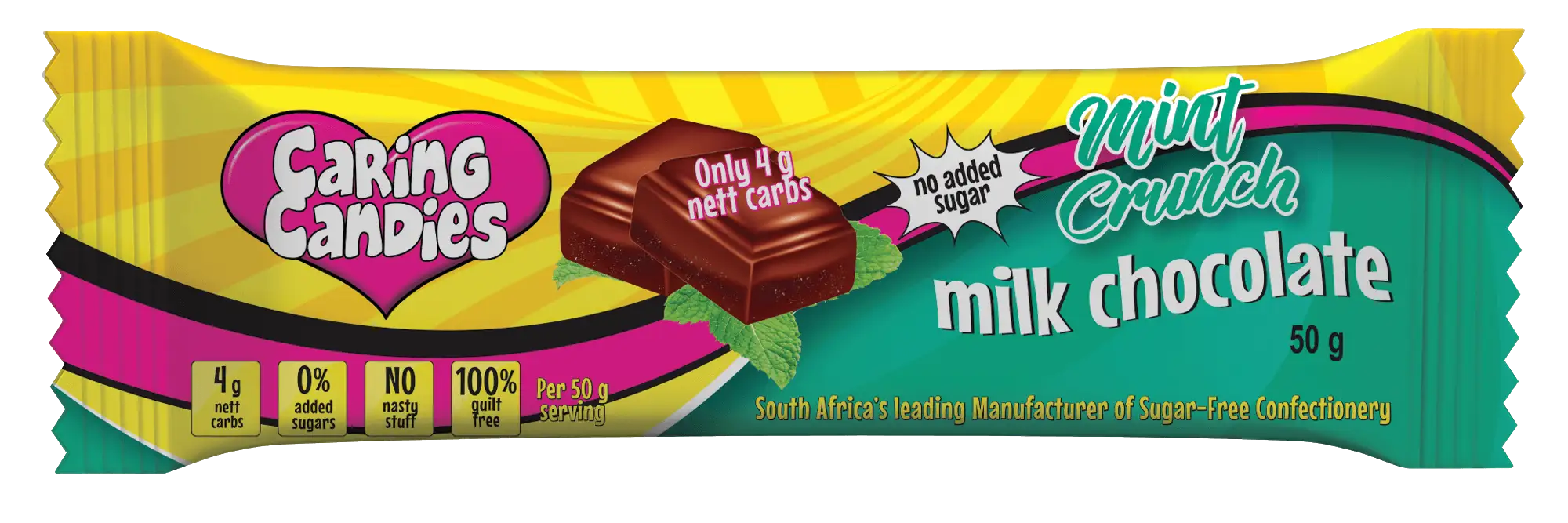
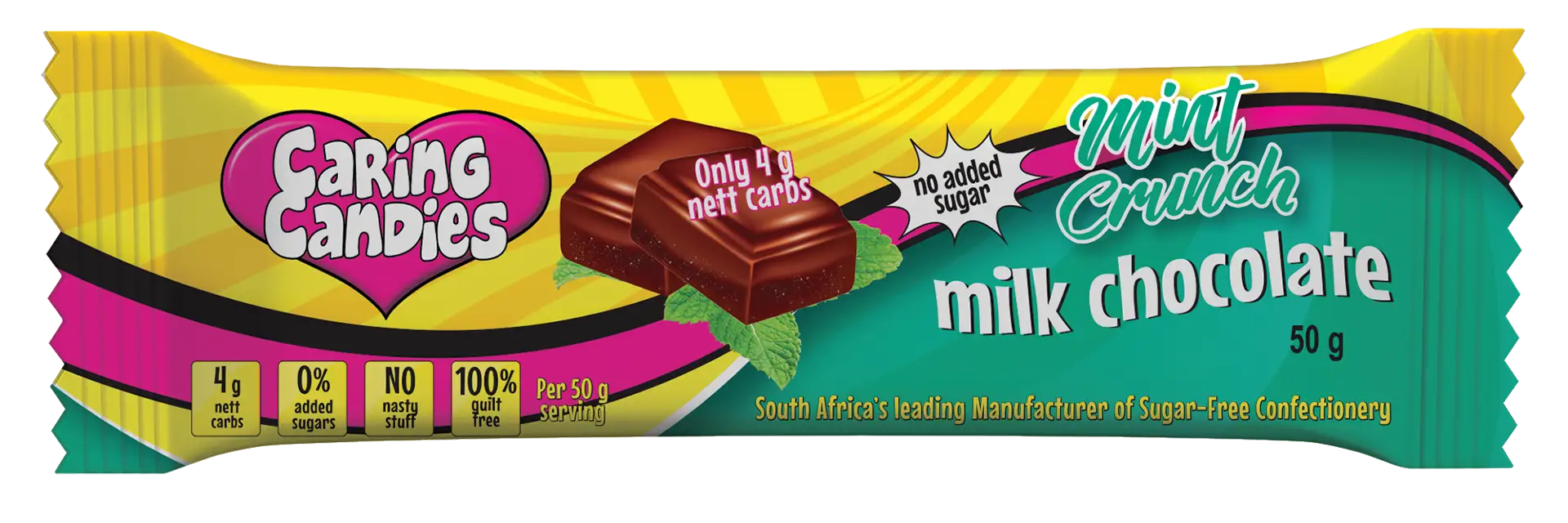
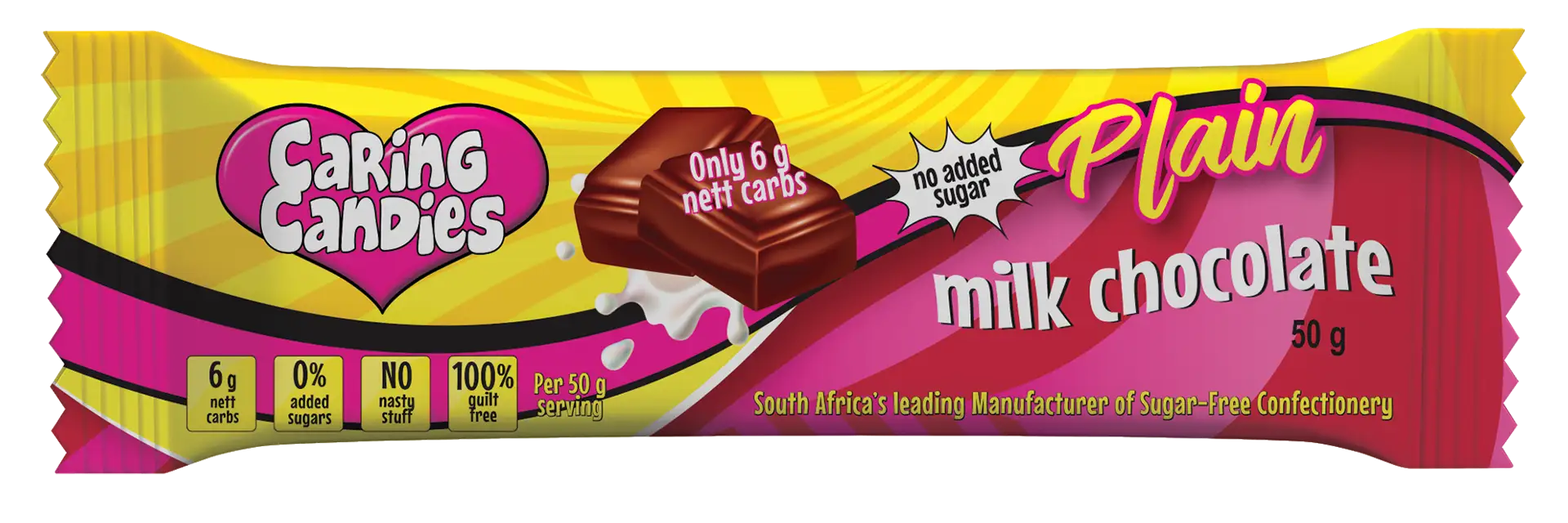
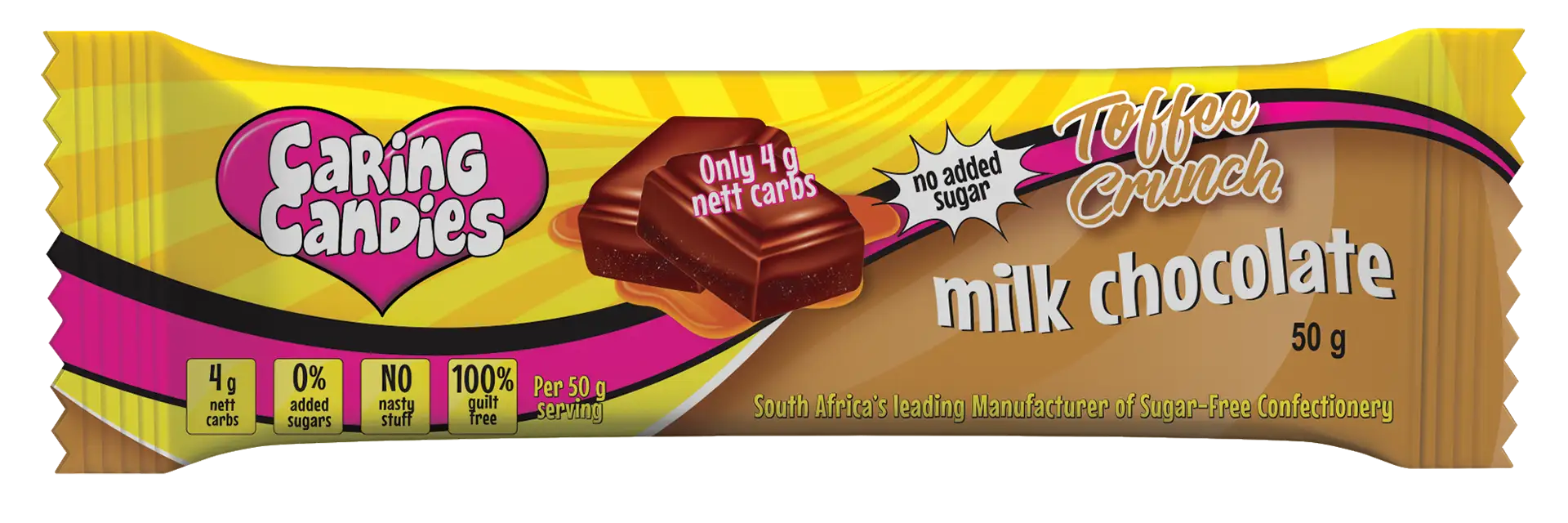
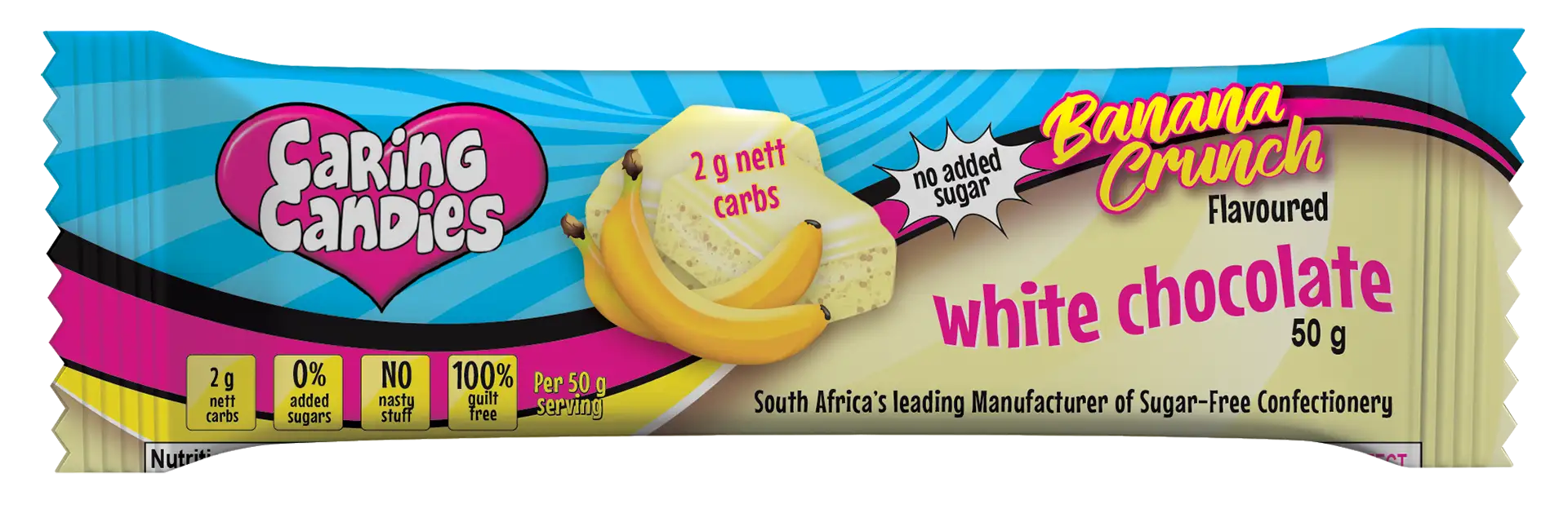
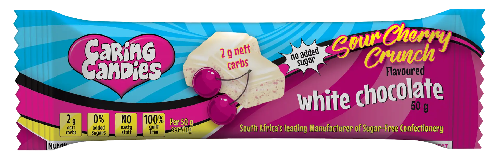
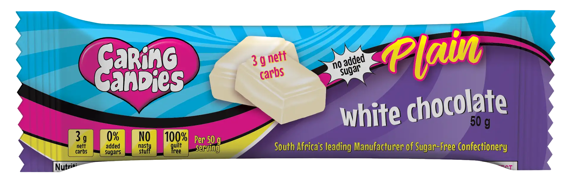
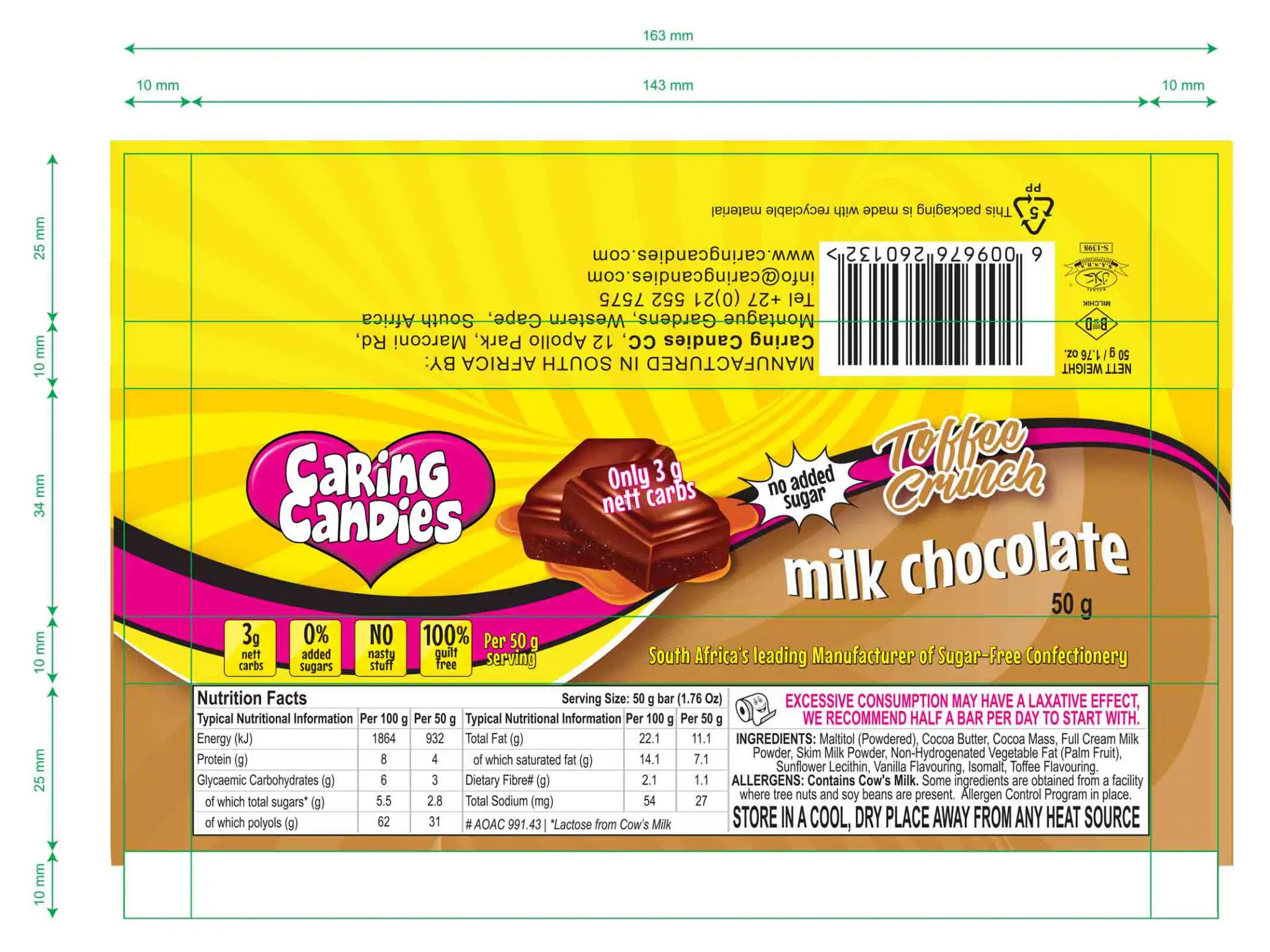
Caring Candies
I produce an updated and practical identity that could speak to local and international retailers.
Creative overview
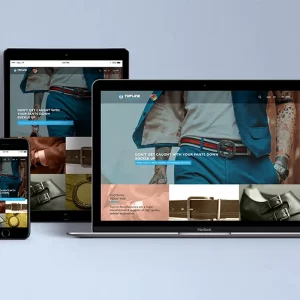
Custom graphics
Packaging design
Content creation
Social Media design
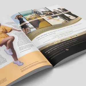
Company Profile
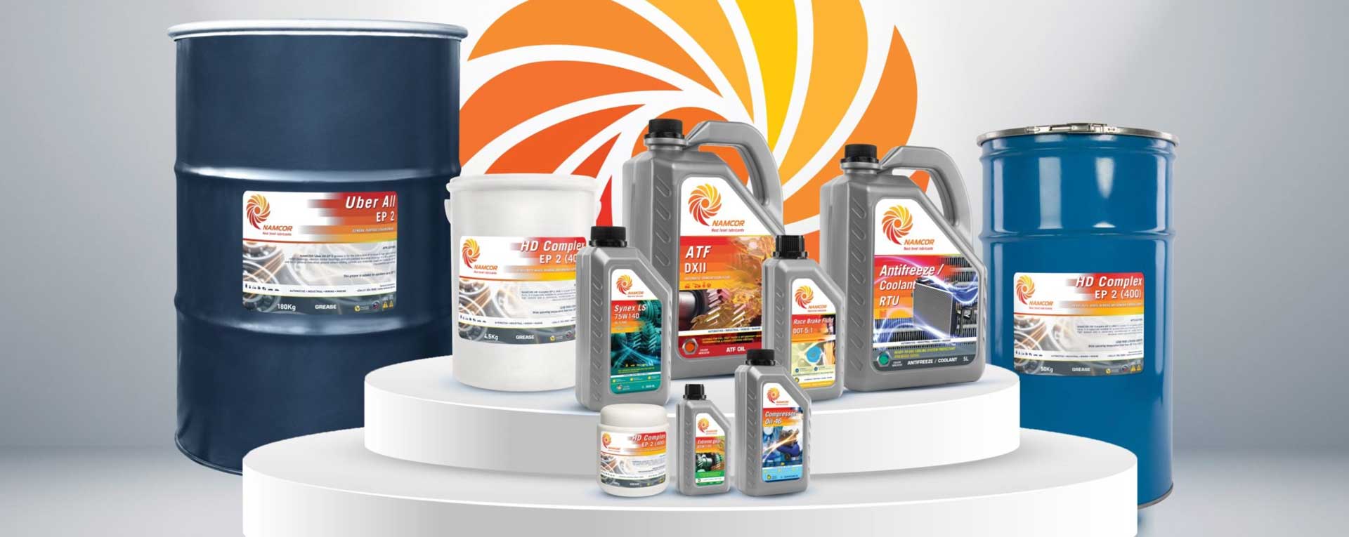
Packaging design
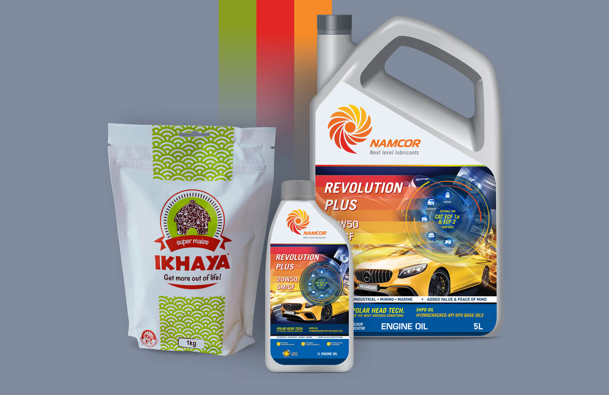
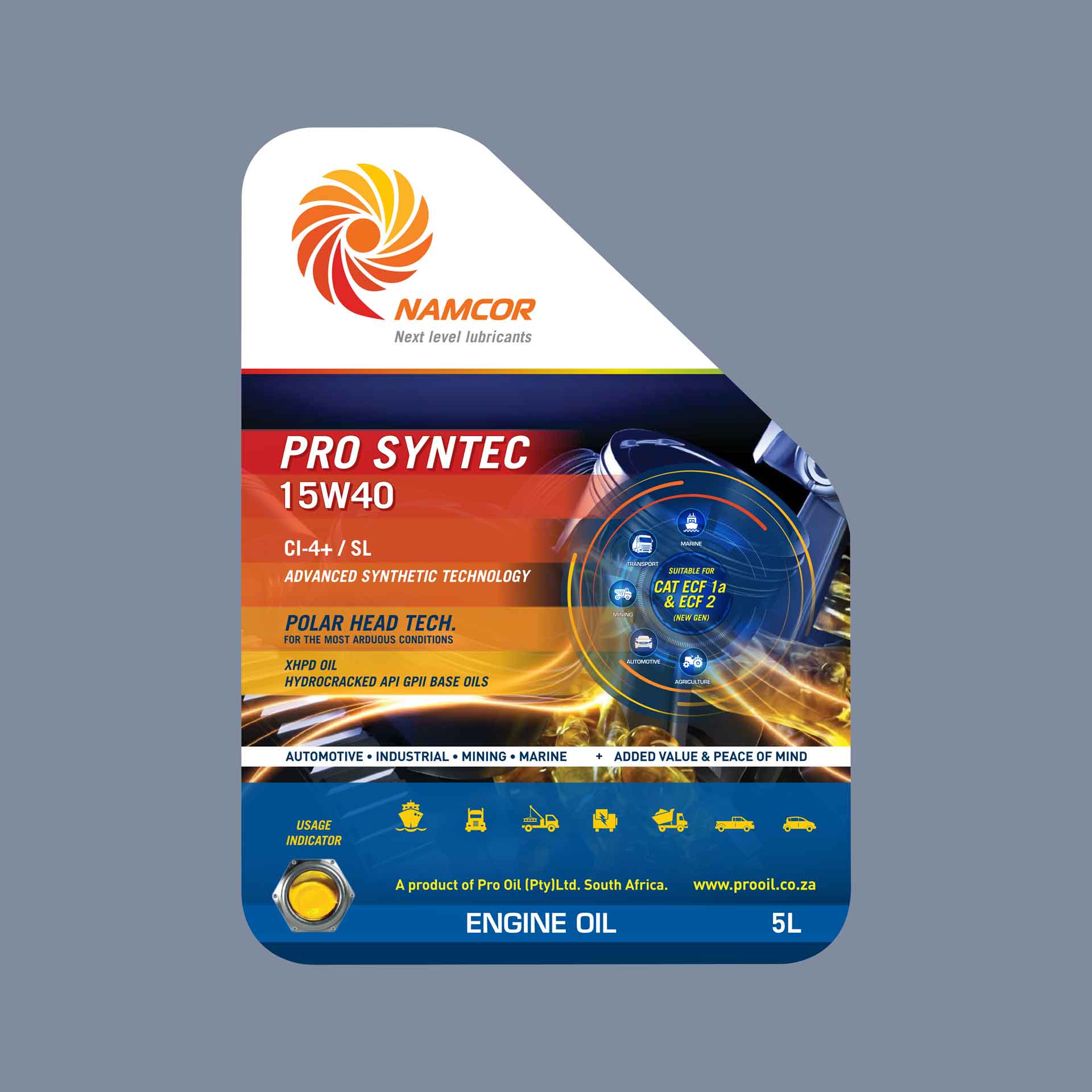
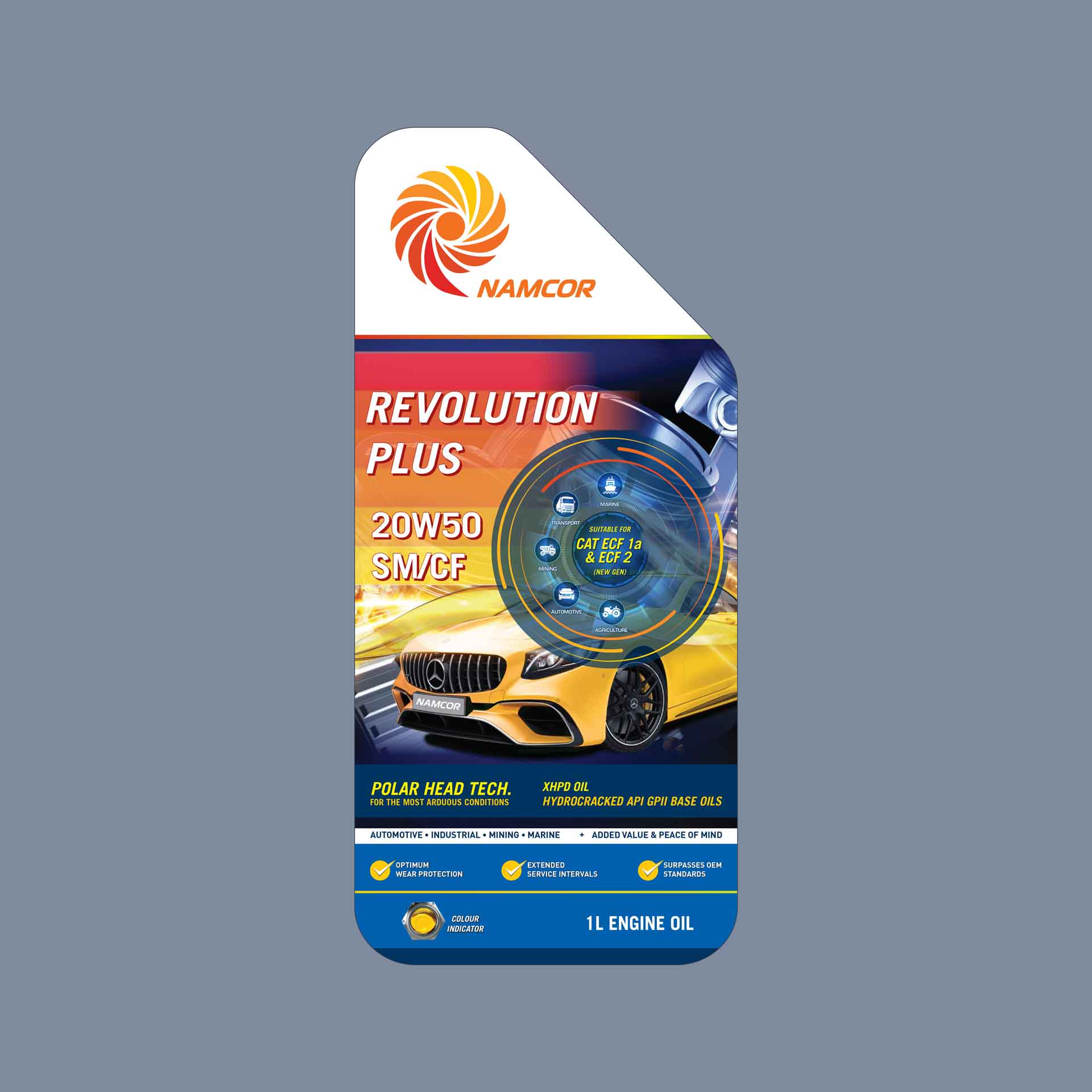
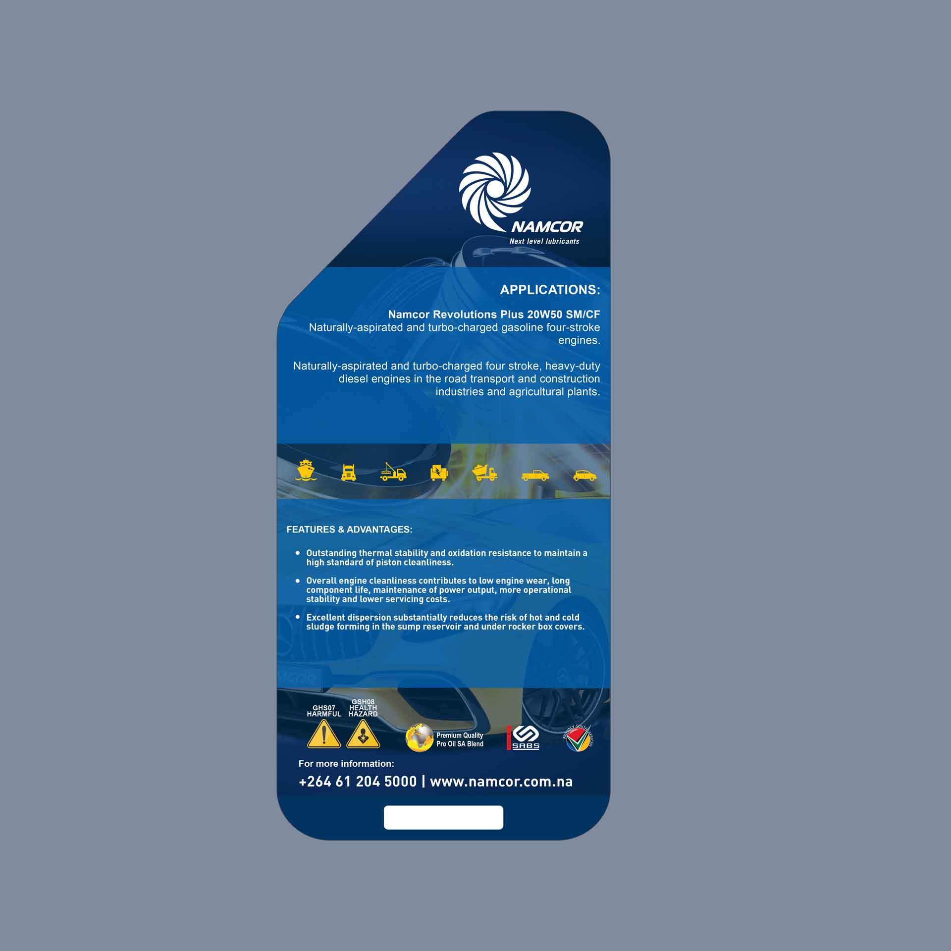
To conceptualise, design and supply new product packaging and display mechanisms.
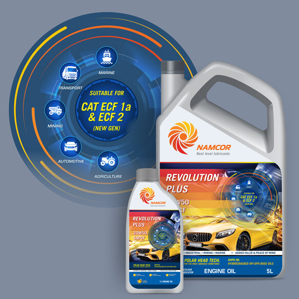
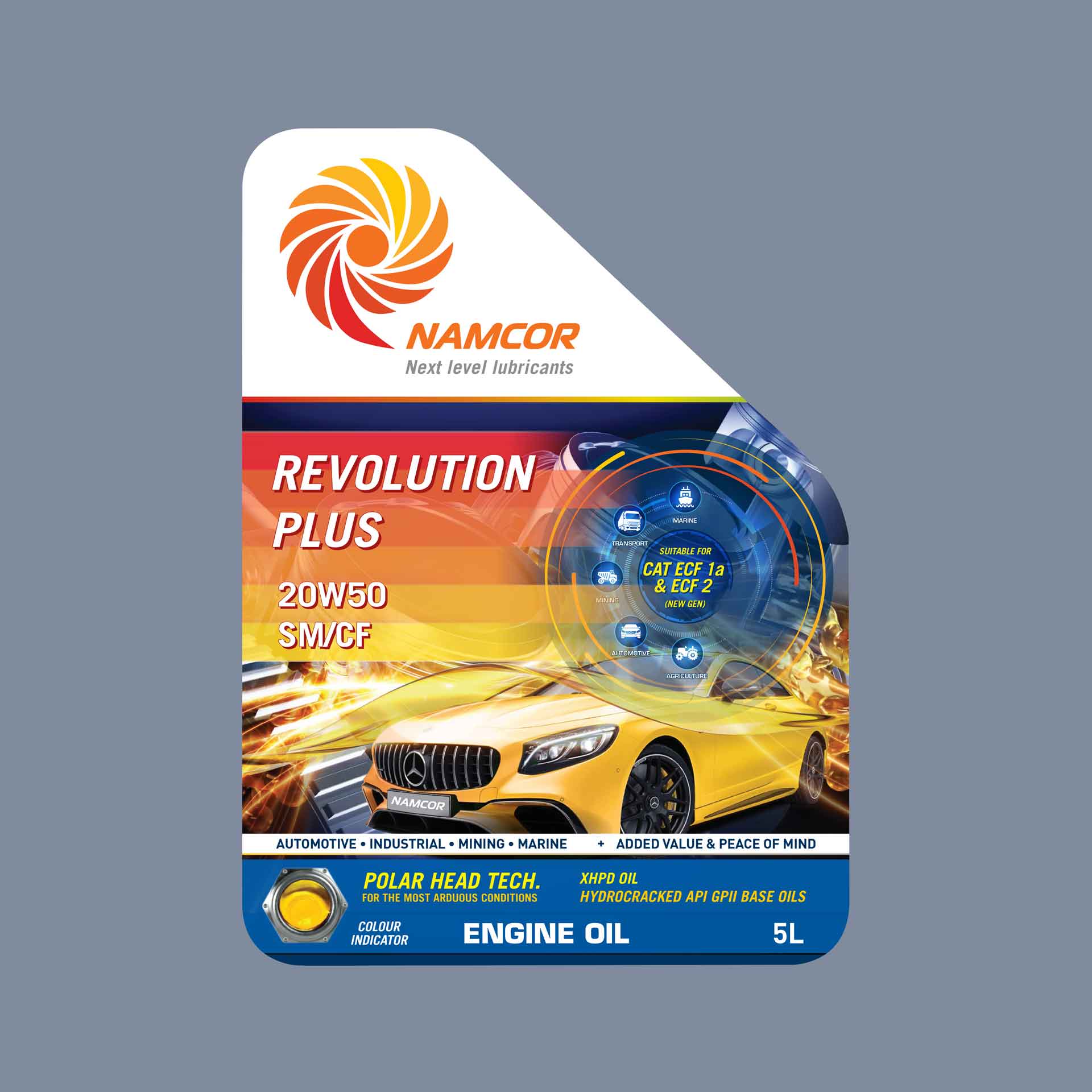
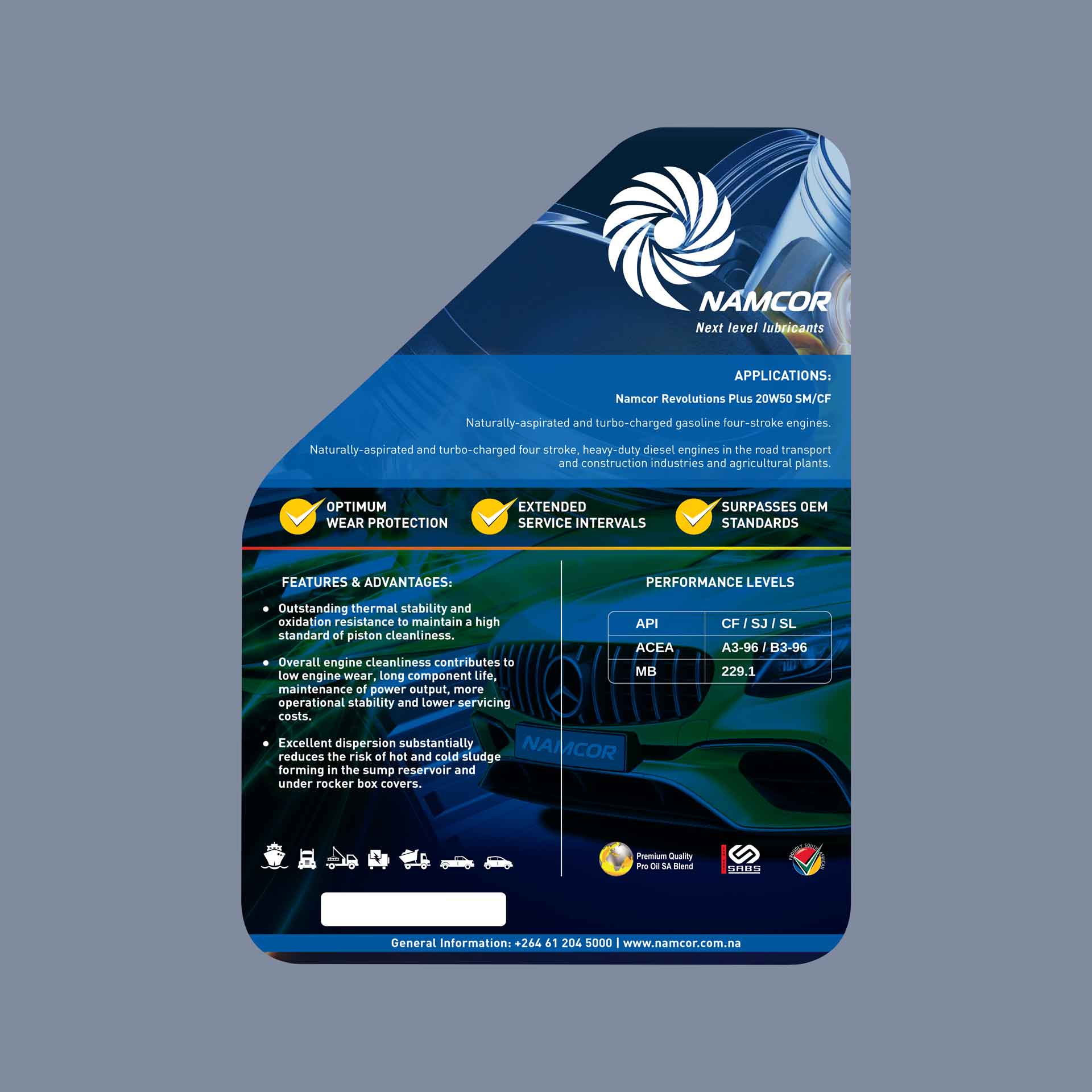
I designed the entire range of lubricant packaging, including all 3D graphics, icons, and infographics, into various label sizes and shapes.
Problem
The problem was users failing to read the labels correctly and using product lubricants in the wrong applications!
Solution
My solution? A graphic mechanism.
I designed an infographic, to appear on labels for products with multiple uses, as a marker and identifier mechanism to indicate what type of vehicle and application the lubricant may be used for.
LABEL GALLERY
BASIC DESIGN SYSTEM FOR ENTIRE RANGE & SIZE VARIANTS.
Follow manufacturers range and support with colour coded categories (primary colour) and colour coded fluid identifier windows on the front label.