

Logo
design
by michael john
Logo Case Study
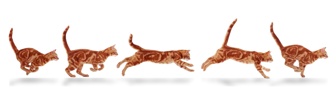
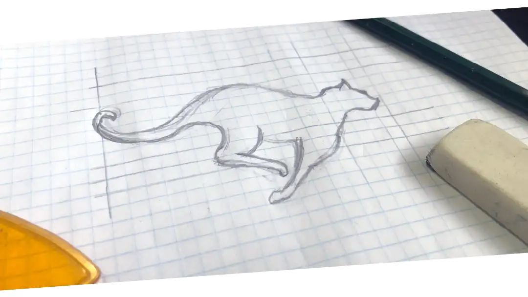
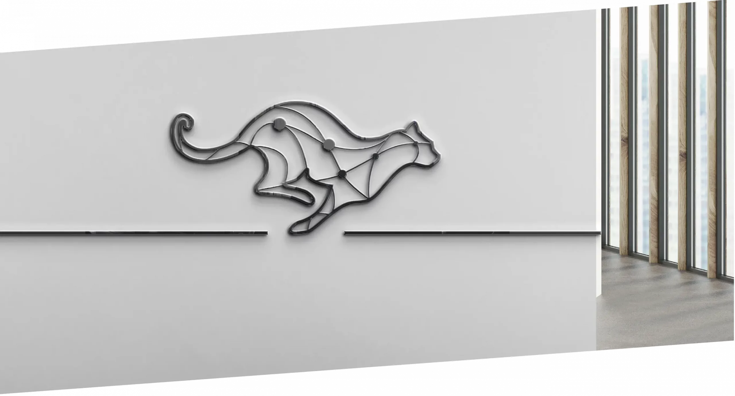
"Inspired by my cat!"
I realised that a Cheetah represents the brand perfectly if the concept is executed properly
THE Problem
A new ISP provider of foreign origin and investment is struggling to grow awareness and following in central Africa. Due to political uncertainty, trust and inclusion is a big problem in central Africa, and they need a robust communication network.
THE STRATEGY
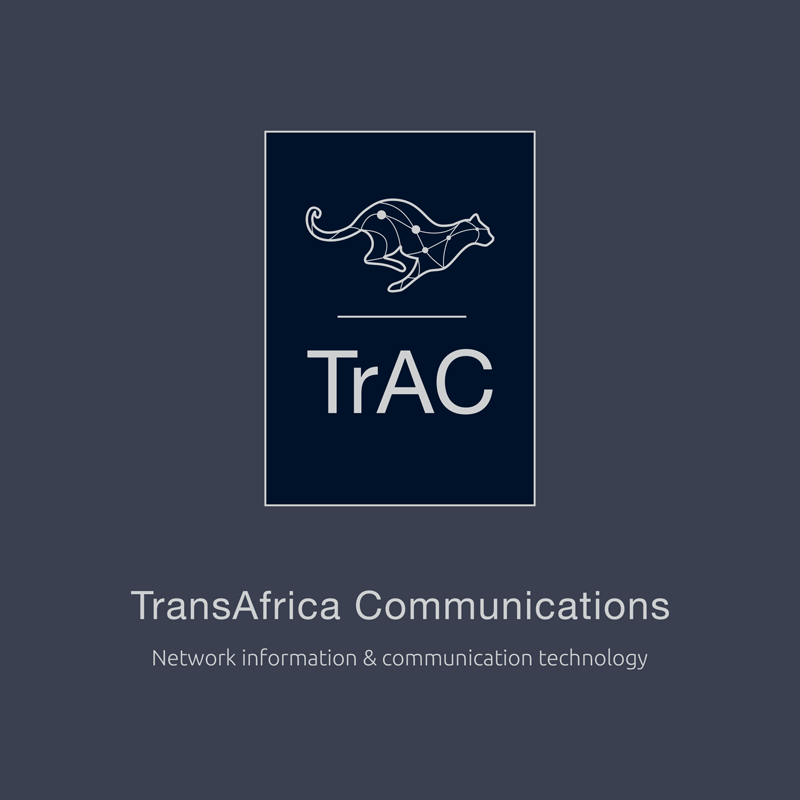
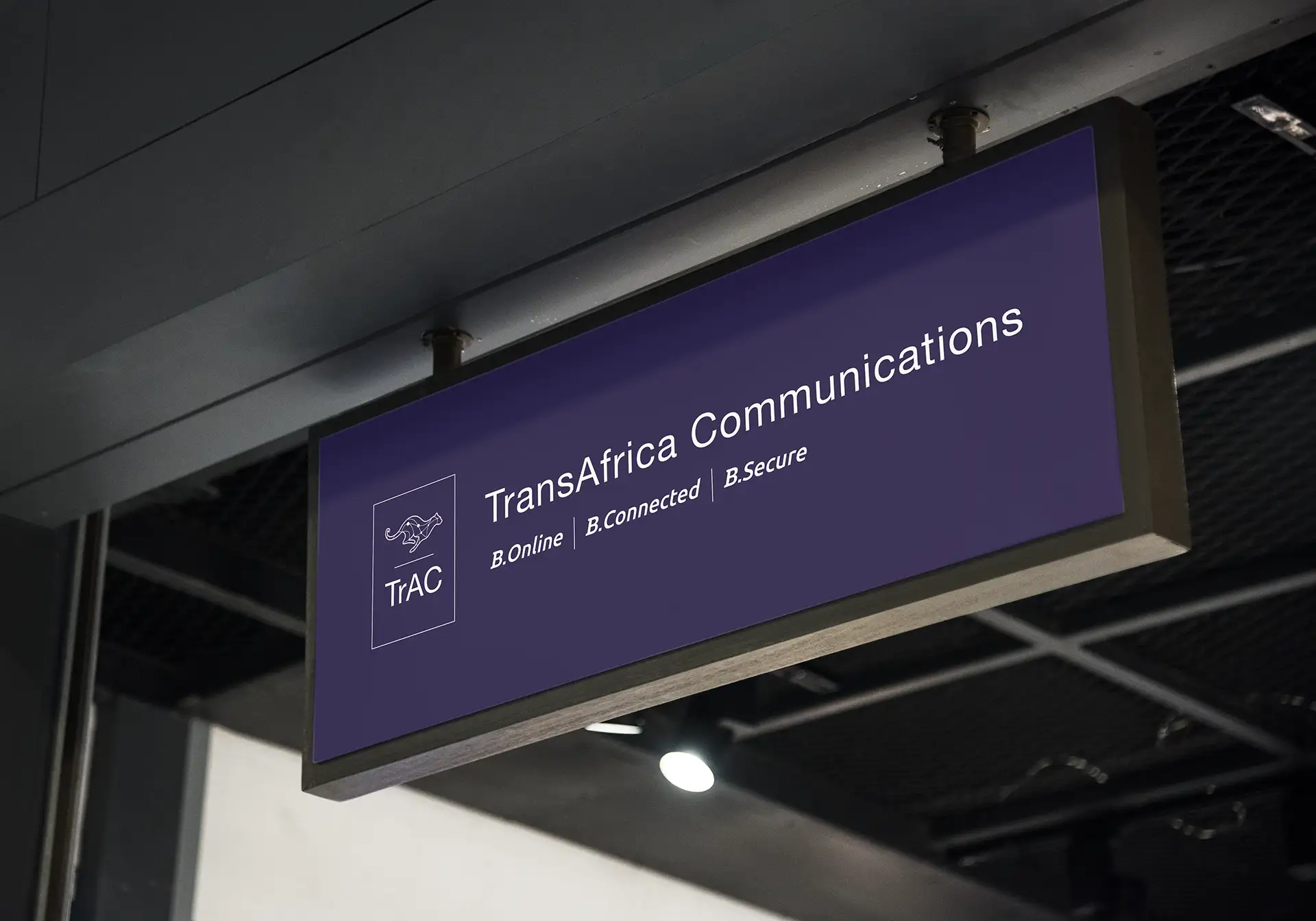
Create a brand identity with the look and feel of an international investment company, with an African influence.
Tailored to reflect local contexts, cultures and an emotional appeal.
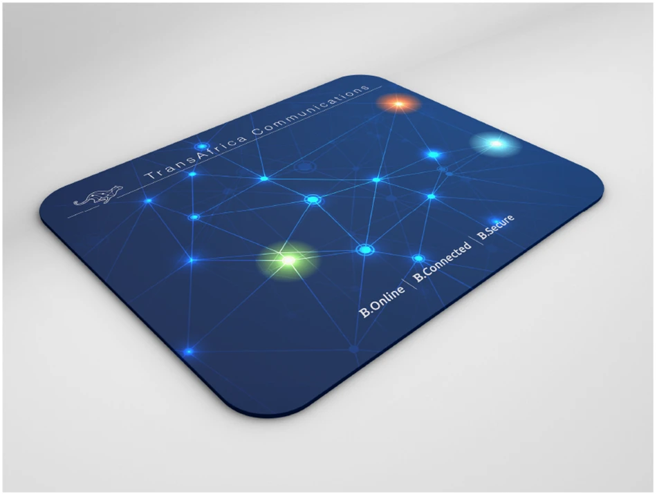
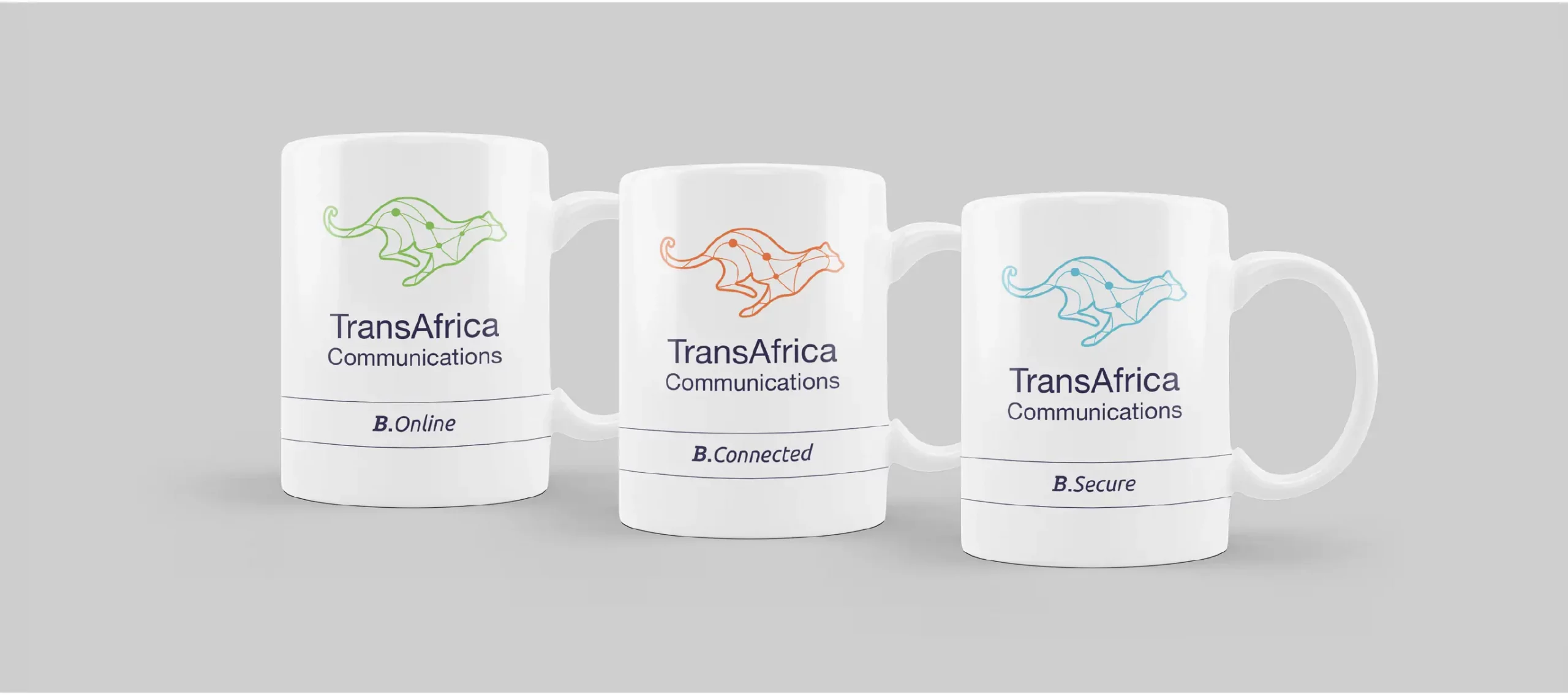
Vibrant & culturally resonant colours reflecting rich diversity.
Vivid graphics of strong network coverage & uninterrupted connections can emphasise reliability.
Clean, modern design that conveys professionalism and approachability.
THE RESULT
By focusing on these visual strategies, TrAC can effectively communicate its commitment to stability, trustworthiness, and inclusivity, thereby overcoming the key challenges mentioned.
I used shades of blue, which are traditionally associated with trust, alongside white to signify transparency and openness.
Increased brand integrity
Increased brand trust
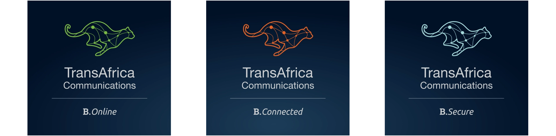
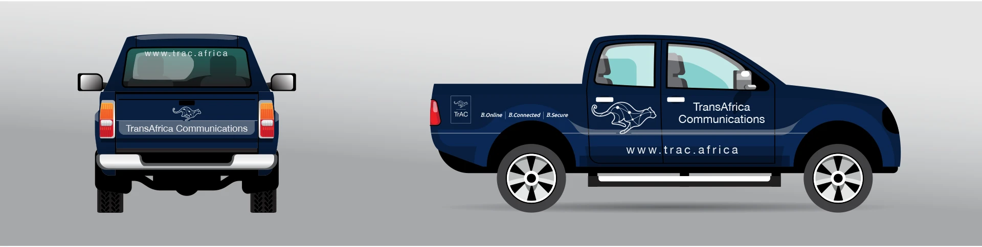
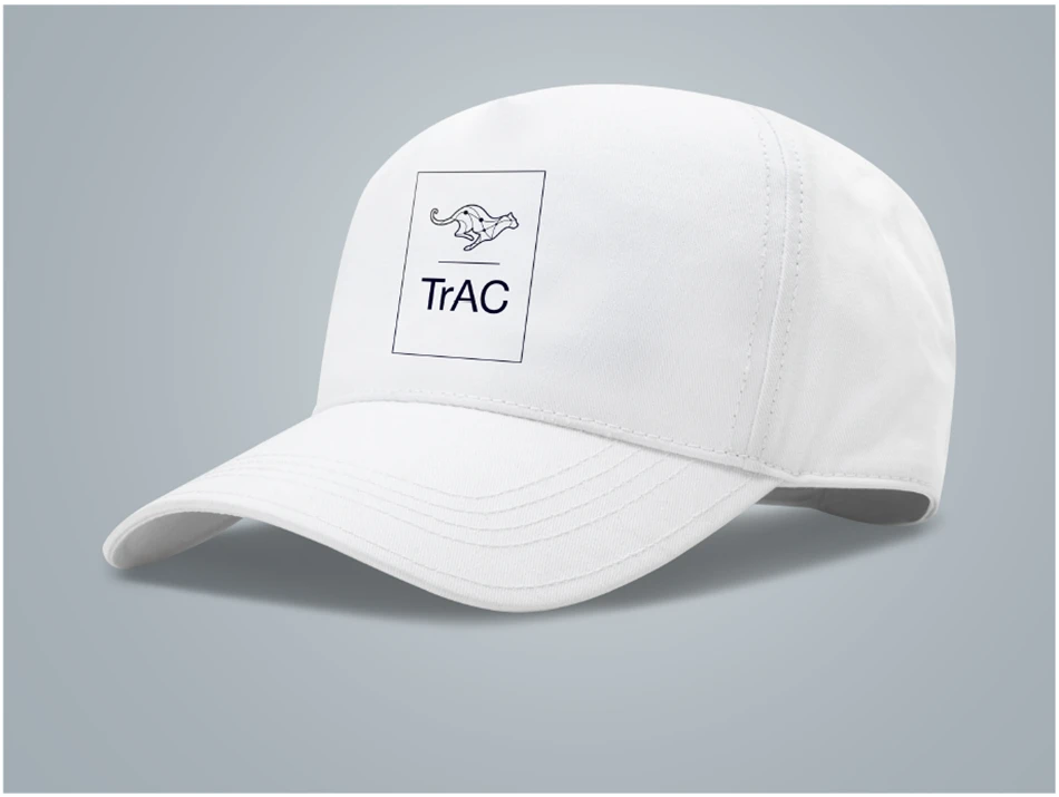
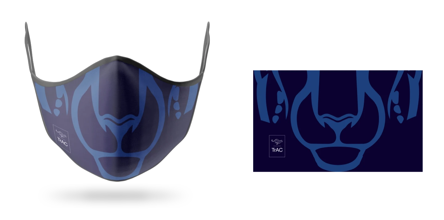
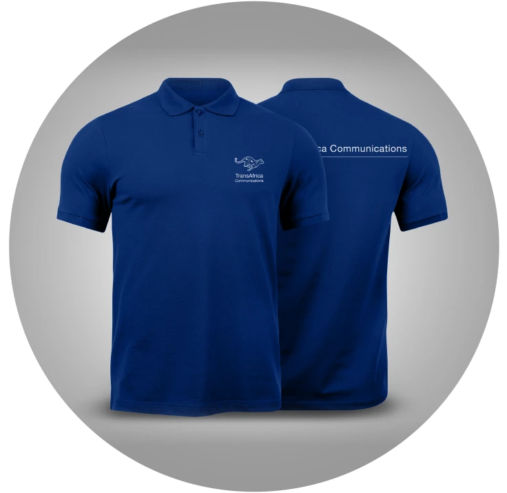
Deliverables
I produced a brand manual and designed all the branded assets.
Current project
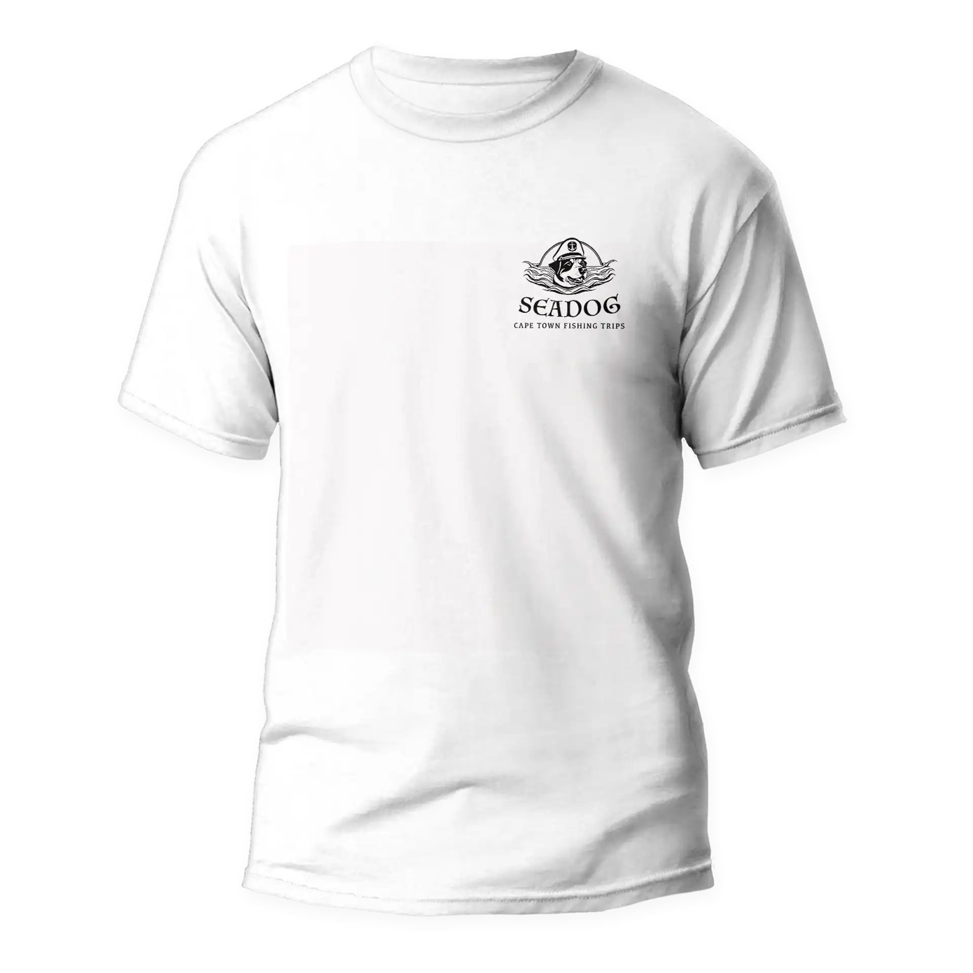
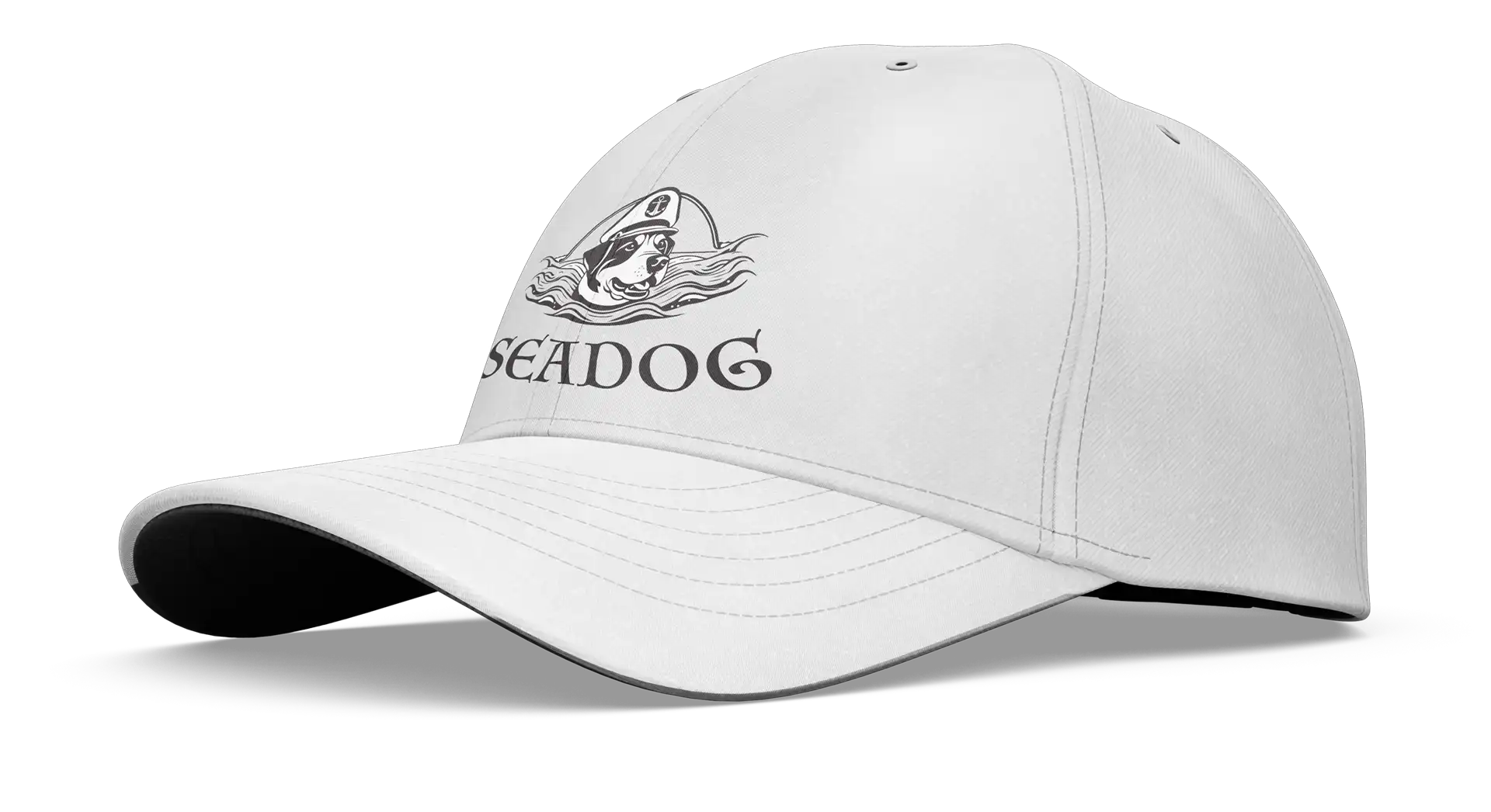
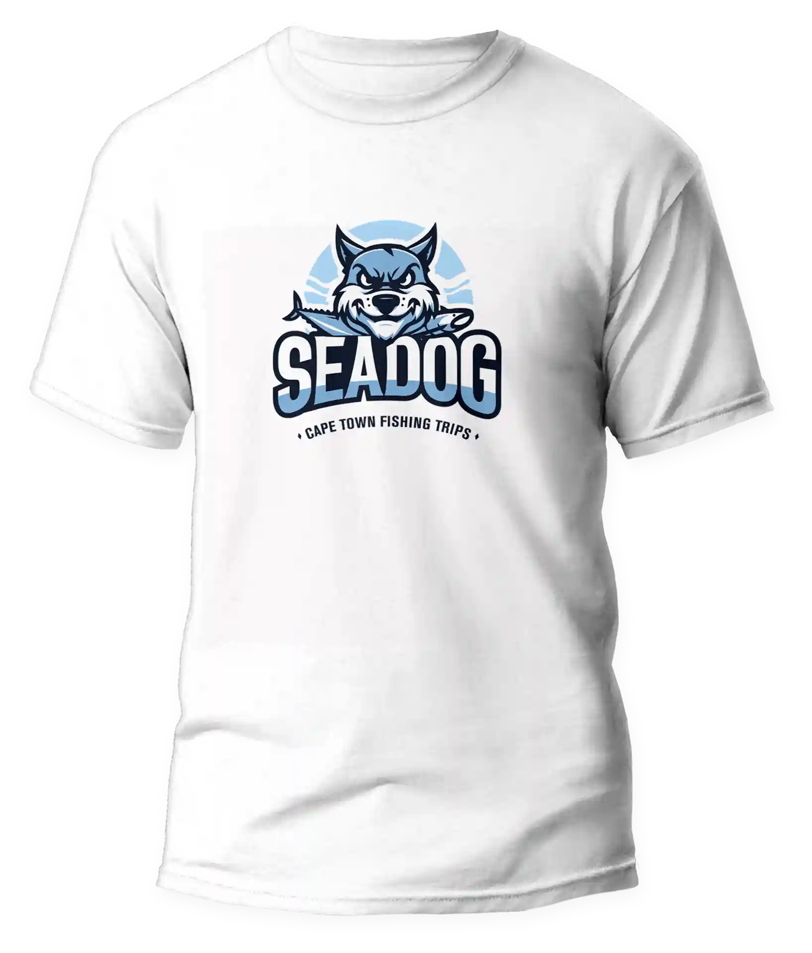
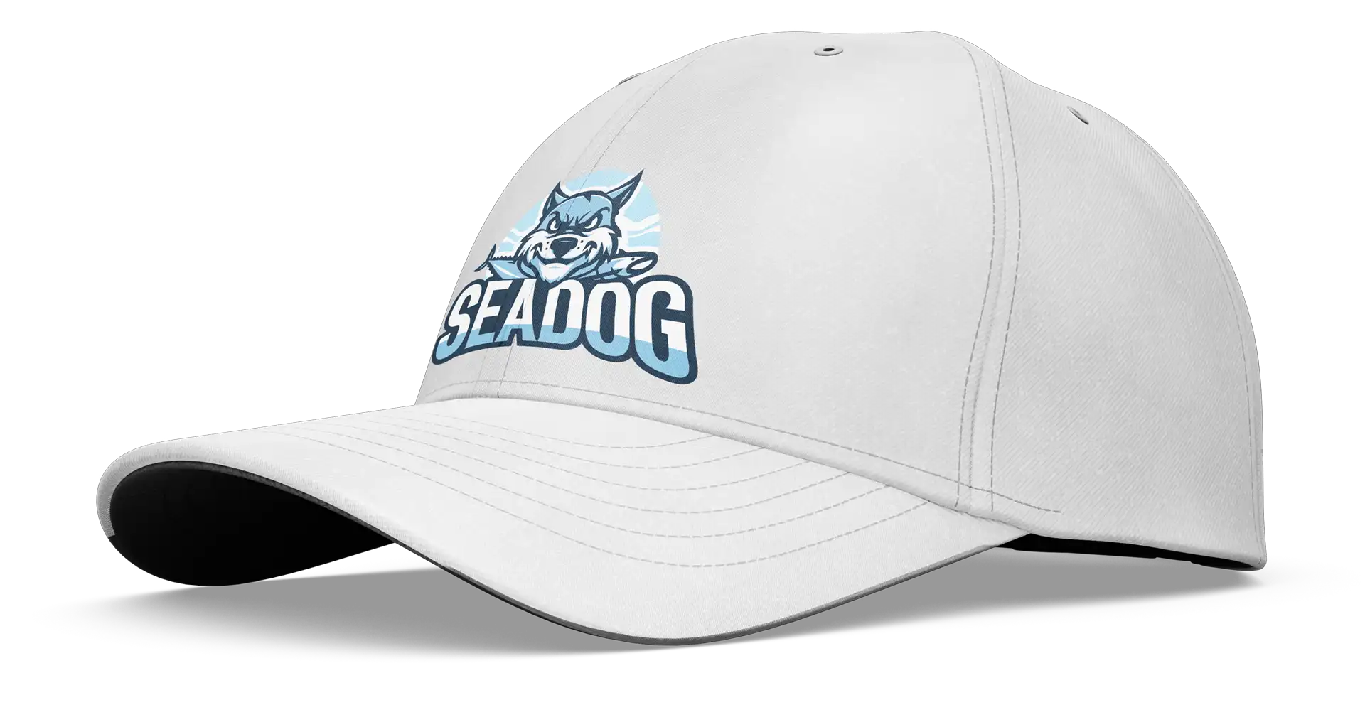
Sea Dog
A Tuna Fishing team of enthusiasts asked for a logo. The requirement was a 1 or 2-colour iconic representation of the team. I came up with 2 options:
- A classic (traditional) styled 1 colour,
- A 2-colour contemporary version, with attitude.
Portfolio
Pushing the envelope of what’s possible, building lasting quality brands and engaging graphic content is my thing!


Contact
Johannesburg
Randburg
Capetown
Northern Suburbs